So many little lessons in one crazy fun painting!
Sometimes the most fun things can come from situations that are so simple. This pumpkin head painting for example. During the month of October, one neighbor around the corner, begins decorating for Halloween early in the month. This big pumpkin head towers over me by many feet, and is quite large. Bigger than a human head anyway. The first time I see it, it usually startles me, then makes me giggle. This year, I knew I was going to paint it! He stands it up amidst dried corn stalks, and somehow mounts it on a pole with a black drapey garment that blows in the slightest bit of wind. There are stick branches for arms that reach out in a slightly menacing way!
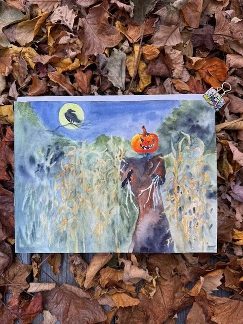
I had in mind painting an image that I could use for a greeting card. The image would fold in the middle so that there would be the pumpkin-head on the front, and the raven on the back of the card. I loved the corn stalks, but wanted them more defined closer to the pumpkin, and softer/less defined the further away you get from the pumpkin. I also loved the idea of a raven and full moon in there. So, the pumpkin head and corn-stalks were something I observed every day on my walk, the other elements were just pulled from imagination to make a spooky composition.
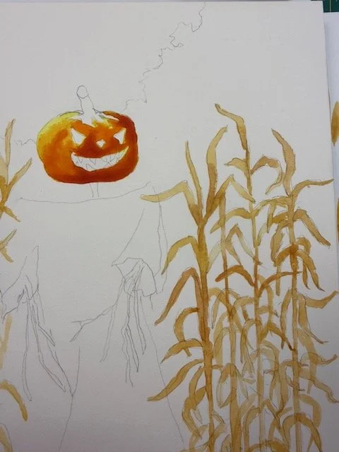
I start with a pencil drawing. I’m working on a block of Fabriano hot-pressed paper. I want to keep all my options open - in case I want to add ink or other mediums later, I want a fairly smooth surface to work on.
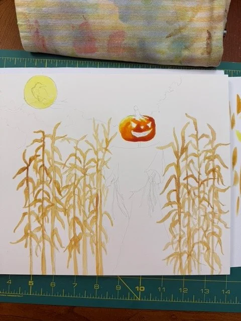
I continue building up the base of this painting, all these corn-stalks, the face of the pumpkin, and the moon with the raven silhouette across the front of it. On the left side of the page (further away from my focal point), rather than draw EVERY single cornstalk, I know that I’m going to simply brush those in, a mere ‘suggestion’ of the shape, rather than the whole thing drawn with all the details.
Note- one thing I learned from studying the impressionists, the crispest details are those all surrounding your focal point. Anything further away has the edges softened, and is less well defined. Any time I can use this to my advantage in a painting, I DO!
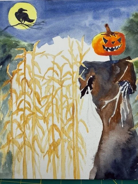
I continue painting around the page. I’ll paint the sky using a wet-into-wet technique, and paint carefully around the moon. I’ll keep the edges soft where the tree line meets the sky. I’ll continue the tree line into and around the corn stalks as the back-drop behind them. The area. I’ll soften some of these edges where the tree line and corn stalks come together.
Where you go to soften edges, don’t ‘scrub’, or you’ll dig up that first layer, you don’t want to erase it, just soften some of these edges.
From studying masterworks of the Impressionists, they will keep edges more crisp and clear near the focal point and soften those edges further away from the focal point. It is the way our eyes naturally see. Things in the periphery are not as crisp as places where we choose our eyes to focus!
Once the sky is completely bone dry, I paint the raven in the darkest colors I have on my palette (probably a mixture of indigo and burnt sienna, in a milk mixture. I always test my mixtures on a ‘test swatch’ of paper to make sure I’ve got enough pigment in there. I want to do this in just one pass if possible rather than several.
You can see where I’m adding the tree line behind the corn stalks, I paint a bit of water in there first, and drop the color in wet into wet. When you’re painting this way, you’ve essentially got more water than what you might think, so the mixture on your brush is going to get diluted a bit. Keep that in mind when you’re making your mixtures. You may need to add more pigment to deepen the color (remember - watercolor will dry lighter than what goes down on your paper…unless you are using the QOR brand, which has a different binder than other watercolor paints). Also to consider, just use your photo reference as your ‘jumping off point’. When you are looking at your painting, consider if there are areas that you want a bit lighter vs. darker.
The final step that I take is to knock back the intensity of that bright moon. Cerulean blue is great for this purpose. It’s semi-opaque, so you can use it like a ‘veil’ of color to tone things down just a bit. Practice this on a scrap sheet first. Paint a bright yellow moon. Let it dry completely. Mix a puddle of cerulean blue. Using a flat wide brush (perhaps your 1/2” flat brush), and paint over that yellow moon on your scrap paper before you take this to your finished page. You can also use this to tone down some of the areas of the cornstalks if they have too much contrast.
I’m hoping you’ll try some of these practices today:
try something a little bit more challenging than the last thing you painted. Remember, it does not have to feel Rembrandt worthy! Remind yourself that ‘this one is just for fun’! You may surprise yourself with the things you learn during the process.
you could paint everything with crisp clean edges….OR, you could think about your painting in a more ‘painterly’ way - be deliberate about your focal point. Keep items that are close to that with crisp, clean details. Items further away are softened to create a little atmospheric distance.
Cerulean blue (I use Daniel Smith brand) makes an interesting veil of color to use layered over other colors to ‘tone things down’ just a bit. You can use it not only like the examples I’ve listed today, but also to add atmospheric distance to a landscape as well!
Happy painting! Let me know if you’ve tried any of these lately!